This semester of school I have made a major decision, and it boils down to this. I will not be making work solely for my betterment as a student. I have worked too hard and too long at creating relationships with galleries and artists to stop for the sake of my education. With this in mind the first project that I am working on for my present study is the Billboard Project, which I will be participating in. I have two images ready to be used on a billboard in downtown New Orleans. This is great not only because of the immensity of the project but also because I have never shown in the state of Louisiana before. This exhibition will knock of the tenth state in my goal to show in every state in the union.
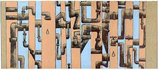
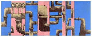
I have been sticking with the crosshatching and negative space painting method for a series of pipe drawings as my first go around. I have found that as I paint, I often lose some of the energy that my drawings possess. I am sure that the same energy can be achieved with paint, but I think with a little more focus on the drawing I may get myself to a better place than I have been recently. Then, hopefully, I will be able to return to the painting with a fresh mind and the capability of making it more loose and expressive. With any luck these qualities will come out as free as the drawing and not appear contrived.
But enough of that. I have drawings to show you, or are they? I don’t know what to term these pieces. They do have paint on them. How much paint is required for it to be a painting? I suppose I am merely defining the characteristics of my drawing so it would fall into drawing. Thoughts?
I am not sure why, but sometimes the cheapest materials are the most fun to work on. Chip board takes an ink hatching really nicely, and lets be honest, there is little that acrylic paint won’t adhere to. I am very fond of this piece. I enjoy how the color of paint is not so different from that of the board surface. It is subtle but not without contrast.
I am not sure that I am as big a fan of this particular color combination. Perhaps I should have gone with more of an off compliment green. There is a lot of pop in this but that blue seems so solid even here in digital form. I am also not so certain that I appreciate the large swatches of pipe drawing as the more segmented piece.
I have more to share in the near future. This blog was far easier to keep up with when I was not in school. Frankly the scanning alone is often forgotten at this point, but like I say, I want to be doing more projects for me. It is good for my sanity, and as an anti-depressant.
I hope all of you are doing rad.
Peace
Mike

